Last week I took part in a debate entitled „The Great Residential Housing Debate – the next Bubble or a legitimate Boom?” at the annual conference for Perennial Investment Partners in Melbourne, Australia.
We were debating the issue of whether Australian house prices–which are rising rapidly now after only a small fall in 2008–represent a sustained boom, or a bubble that will soon burst. I put the Bubble case and Chris Joye of Rismark International presented the Boom case (here is my paper and my presentation). As is well-known, Australia is one of the few countries in the OECD not to experience two quarters or more of falling GDP as a result of the GFC, and probably the only country that has not experienced a sustained fall in its property market.
The conference was held twice, firstly in Melbourne on Wednesday February 24th, and then in Sydney on Friday 26th. There were roughly 400 people in the audience on both occasions, all of whom were customers of Perennial–with the majority (roughly 75%) being financial planners. The conference employed an electronic voting mechanism that let participants answer general questions, as well as rate the speakers. In our debate, it was used to work out where people stood on the „Bubble vs Boom” spectrum both before and after the debate. A „1” indicated a complete Bear who expected property to crash and advised getting out now, while a „10” was a complete Bull who advised „Buy, Buy, Buy”.
Prior to our debate in Melbourne, the average score was 4.9. This surprised me, because I expected the audience to be generally pro-property; however a score of below 5.5 indicated that overall the audience was bearish on property (since the average of the ten numbers from 1 to 10 is 5.5; also see ** below).
After our debate, the score was 5.2–a small move in favour of the bullish position, but still slightly in the bearish camp. Chris commented that this was „about even” and „too close to call” as he left the stage, which I thought was a fair enough summary of the outcome.
So I was stunned when Crikey asked me to respond to the report Chris had given them of the Melbourne debate („Reflections on Cage Match Mk 1„), which included the statements that:
So I think I pretty comprehensively monstered Steve Keen at our debate in Melbourne yesterday. That was certainly the feedback from those who attended (there were 500)…
While I felt I was able to intellectually tear Steve apart limb-by-limb, I will say this: he is a lovely guy. Very diplomatic and humble in defeat…; and
Unfortunately, the electronic scoring in yesterday’s debate was a bit convoluted: it measured the shift in the audience sentiment from bearish (Steve) to bullish (Chris) before and after the event. On that basis, I won. But I think a simpler Chris versus Steve voting system would have made the difference much more striking…
The rest of the post was of a similar vein–though there were occasional caveats such as „As I noted in my presentation, Steve has made some valid criticisms of conventional economics, and its neglect of debt capital market imperfections. And he deserves some kudos for anticipating a credit crisis” (gee, thanks!), even this was immediately followed by „But whatever strengths he possesses are overwhelmed by his propensity to make silly statements.”
I had no intention of commenting on the debate prior to seeing this hit a national news site, but of course this couldn’t be ignored–though at the same time it didn’t deserve to be taken seriously. So I took a facetious approach–opening my reply with „I don’t know what Chris consumed after our talk at Perennial’s conference yesterday, but if he has any spare I’d like to try it at a party tomorrow night”, and concluding with the advice to Chris that, „Next time, after a conference, don’t consume anything, just take a cold shower” (I also pointed out the statistical fact Chris apparently missed, that the middle point in scores from 1 to 10 is not 5, but 5.5).
Chris took this rejoinder very well–despite our fundamental differences over this issue, we get on well personally, and unlike some participants in this debate, he does have a sense of humour.
And so we proceeded to Sydney. There the audience was slightly less bearish than in Melbourne: the average score prior to the debate was 5.3, just slightly below the neutral level. But after the debate, there was a significant shift towards the Bear case. The post debate score was 4.6.
Chris had made the classic mistake of declaring victory at half-time, only to get a cold shower with the full-time result.
Why Debt-Deflation Causes Depressions
„Declaring victory at half-time” is a syndrome which afflicts the entire debate over our current economic situation: optimists are of the opinion that the crisis is all over now, while pessimists think it’s only just begun. On this front, as always, I regard history as the best indicator of who may be right. On this front, I can’t commend highly enough the site New from 1930, which from January 1 2009 began publishing summaries of the Wall Street Journal from January 1 1930. The last few entries include these pearls of wisdom from February 1931:
An Old-Timer believes the market rally “will do more to restore prosperity than anything else.” Total security values have increased over $20B since start of year; barring another dive in the market, this assures a recovery since the 10M-15M US owners of stock feel richer. Bulls say the ease with which considerable profit-taking has been absorbed recently is “the surest indication of a strong healthy market.” Market has rallied very substantially; “if it runs true to form, it will have one of those ‚healthy reactions’ that will, according to the bulls, strengthen its ‚technical position.’” “The buying power of the people and the corporations still is large … In other words, the country never was in a better position to stage a comeback after a depression … (Feb. 25th)
One banker cites plenty of evidence that the backlog of consuming power is largest its been in years: corp. inventories are down 20% from a year ago, and even more from 2 years ago; corps. are holding more cash; production of many products is below requirements; products have been wearing out for 18 months of deferred buying; security values up $20B since Jan. 1; easy credit; record-breaking savings deposits. Last year there were few rallies on which to sell; this year there have been few dips on which to buy. Public interest has grown this year, but is still small compared to 1928 and 1929; “a market with a growing public interest is a dangerous market to sell short.” (Feb. 26th)
Yeah, right: in both 1930 and 1931, the belief was widespread–at least in the financial community–that the Depression was over, and recovery was just around the corner. As Australia’s Alan Kohler noted when he first discovered this blog, at least early on during the Great Depression, people didn’t realise that they were in it. They too, were declaring victory at what turned out to be not even half-time.
Ultimately, the debate over whether we’re in a complete recovery or merely a temporary recess from the GFC will only be resolved by time. But well-informed theory can also give a guide as to what we can expect, and here I regard Hyman Minsky’s Financial Instability Hypothesis and Irving Fisher’s Debt Deflation Theory of Great Depressions as the outstanding guides. However they are complex theories, especially when most economists have been mis-educated by neoclassical economics into ignoring money, debt, and disequilibrium dynamics. So the following numerical example might make it easier to understand their arguments:
Imagine a country with a nominal GDP of $1,000 billion, which is growing at 10% per annum (real output is growing at 4% p.a. and inflation is 6% p.a.);
It also has an aggregate private debt level of $1,250 billion which is growing at 20% p.a., so that private debt increases by $250 billion that year;
Ignoring for the moment the contribution from government deficit spending, total spending in that economy for that year–on all markets, both commodities and assets–is therefore $1,250 billion. 80% of this is financed by incomes (GDP) and 20% is financed by increased debt;
One year later, the GDP has grown by 10% to $1,100 billion;
Now imagine that debt stabilises at $1,500 billion, so that the change in debt that year is zero;
Then total spending in the economy is $1,100 billion, consisting of $1.1 trillion of income-financed spending and no debt-financed spending;
This is $150 billion less than the previous year;
Stabilisation of debt levels thus causes a 12% fall in nominal aggregate demand.
What about if debt doesn’t actually stabilise, but instead grows at the same rate as GDP? Then we get the following situation:
In the first year, total demand is $1,250 billion, consisting of $1,000 billion in income and $250 billion in increased debt;
In the second year, total demand is also $1,250 billion, consisting of $1,100 billion in income and $150 billion in increased debt;
Nominal aggregate demand is therefore constant;
But after inflation, real aggregate demand will have contracted by 6%.
This is the real danger posed by debt: once debt becomes a significant fraction of GDP, and its growth rate substantially exceeds that of GDP, the economy will suffer a recession even if the debt to GDP ratio merely stabilises.
A debt-dependent economy has no choice but to record rising levels of debt to GDP every year to avoid a recession. Unfortunately, this makes a debt-servicing crisis inevitable at some point, especially when a large fraction of the increase in debt is financing Ponzi-speculation on asset prices, since this adds to debt without increasing society’s capacity to finance that debt.
That is why falling debt levels caused the Great Depression, as Irving Fisher argued back in 1933, and the phenomenon is obvious in the empirical data. The next few charts illustrate this argument.
Private debt and GDP levels in the USA from 1920 to 1940:
The change in private debt, added to GDP to show aggregate demand as the sum of GDP plus the change in debt:
Now I calculate the proportion of aggregate demand that is debt-financed, by dividing the change in debt by the sum of GDP plus the change in debt: the formula for is:
The correlation of the fraction of demand that is debt financed (lagged one year since the data is end-of-year annual) with unemployment is minus 0.77. Roughly speaking, this tells us that when the debt-financed fraction of demand rises, unemployment falls, and the correlation of these two series accounts for 77% of the change in unemployment between 1920 and 1940:
Now let’s repeat the same exercise with the data from 1990 till 2010
Private debt and GDP levels in the USA from 1990 to 2010:
The change in private debt, added to GDP to show aggregate demand as the sum of GDP plus the change in debt:
The correlation of the fraction of demand that is debt financed (unlagged since we now have quarterly data on debt) with unemployment (the correlation coefficient is now minus 0.84):
This is why debt-deflation matters, and it’s also why we are barely at the half-time mark in the GFC. Though government spending has countered the fall in debt-financed spending to some degree, that fall has only hit 40% of the level that applied during the Great Depression, even though debt levels are substantially higher (relative to GDP) than they were back then.
The numerical example given above is, by the way, not too far removed from the empirical data for both Australia and the USA prior to the GFC. In the year before the crisis, Australia’s GDP was roughly A$1.1 trillion, and the increase in debt that year was A$260 billion, which was a 17% increase on the previous year; for the USA the comparable figures were roughly US$14 trillion, a US$4.5 trillion increase in debt, and a peak rate of growth of debt of about 10% p.a.
The example also illustrates why the rate of inflation matters, and why a low rate prior to a debt crisis is a serious danger. If inflation is high when the crisis hits (say 20% p.a.) then most of the decline can be taken by a fall in the rate of consumer price inflation itself. But if the commodity inflation rate is low, then the hit will be taken by asset prices and actual output as well as by a fall in the inflation rate.
The process can be countermanded to some degree by the government running a deficit, which counteracts the fall in aggregate demand caused by private deleveraging. But the government deficit would need to be far higher than current levels to return us to prosperity if nothing is also done about the astronomical level of private debt.
With the deficits that are being contemplated today, I expect the outcome to be that the rest of the OECD will „turn Japanese” and enter a long-running, low level Depression. Actions that limit those deficits–or even worse, force countries in crisis like Greece to impose austerity measures to reduce deficits back to zero–will turn this from a drawn-out Depression into a sudden and deep one.
Of course, at the same time that economic policy makers–misled by neoclassical economics–are imposing austerity programs on national governments, they are trying to restart the private debt binge mechanism that gave us the crisis in the first place. I’ll write more on this in a future Debtwatch, but in the meantime I recommend the post on this point on Vox by Peter Boone and Simon Johnson, „The doomsday cycle„.
Why has Australia done so well?
I’ve noted previously that government policy during 2009 boosted household disposable income dramatically, and Gerard Minack of Morgan Stanley recently pointed out just how much: „household disposable income increased by 10.1% over the year to the September quarter, while labour income – the biggest component of household income and traditionally the largest swing factor – increased by just 0.4%.” (Morgan Stanley Australia Strategy and Economics, February 24, 2010: The Odd Expansion). The primary factors driving household disposable incomes higher were the government’s stimulus package (which boosted incomes by about 4%) and the RBA’s rate cuts (which added another 5% to disposable incomes).
As Gerard commented when he first publicised this outcome (Morgan Stanley, Downunder Daily October 9, 2009: Antipodean Lessons), „If that’s recession, bring it on!”: it’s unheard of for household incomes to rise during a recession, and that’s a major reason why Australia avoided a downturn last year.
But it’s not the only reason: the other one, as my numerical example above illustrates, is what happened to debt levels. In our debt-dependent economies today, a recession almost always means a fall in debt levels relative to GDP (while a Depression results from absolutely falling debt). We began that process early in 2008, only to dramatically reverse direction in 2009 so that, once again, debt was growing faster than GDP.
The key cause of this was that other government policy, the First Home Vendors Boost, which enticed Australians back into mortgage debt in droves (both First Home Buyers who actually received the Boost, and the Vendors who sold to them who took levered the extra $15-40K The Boost added to the sale price into another $100-200K for their next house purchase). This policy gave us the fastest turnaround in debt levels in our post-WWII economic history.
Note that the period prior to 1965 had as many periods of the debt to GDP ratio falling as rising–which is the sign of a cyclical but non-Ponzi economy. Then from 1965 on, the trend was for debt ratios to rise faster than GDP except during the recessions of 1973-76 and 1990-94. The period of the Howard Government involved the longest sustained period of rising private debt ever–though notably this trend for rising debt began while Keating was still PM.
Then the GFC hit virtually as Rudd came to office, and the rate of growth of private debt plunged–a similar coincidence to the one that had done the Whitlam government in decades earlier (note that the debt bubble whose bursting brought Whitlam undone had also commenced under the preceding Liberal government of Billy McMahon).
Rudd deserves no blame for the bursting of the debt bubble–as I warned since December 2005, this was inevitable and when it happened, a serious global recession would begin (because the phenomenon was global and not merely limited to Australia). But his government does deserve whatever is deserved–credit or blame–for the rapid turnaround in debt. This wouldn’t have happened without the First Home Vendors Boost, since as is illustrated below, the only source of this increase in private debt has been rising mortgage debt.
Had this trick been pulled back in the 1990s, then Rudd would have received credit for it in the long run, since it would have set off a prolonged boom as debt to GDP ratios rose for many years and gave us a strong if illusory recovery from the preceding recession.
But this is 2010: household debt has risen from under 30% to almost 100% of GDP (the RBA has recently changed its statistics on this front–two months ago the figures in D02 yielded a ratio slightly above 100%), and I simply don’t believe there’s capacity for it to continue rising. So I expect that the trend will rapidly reverse itself back into a falling private debt to GDP ratio, and the recovery this rising debt has helped engineer will evaporate.
That will leave government spending as the one prop to keep the Australian economy afloat, and it is a prop that shouldn’t be underestimated, as the next chart illustrates: though the private debt to GDP ratio turned around from falling at 5% p.a. to rising at 2% p.a. courtesy of government policy, the increase in government debt added another 3% to the mix.
The sum of changing private and government debt thus substantially boosted spending in the Australian economy in 2009–enough to stop the GFC in its tracks here. But in 2010, it is highly unlikely that the private sector will continue re-leveraging. That will leave increased government debt-financed spending as the only boost.
If the government’s contribution remains at about the level of 2009–roughly a 3% boost–and the private sector continues the deleveraging it was doing before government policy kicked in–at a rate of close to 6% p.a.–then the net outcome will still be a falling debt to GDP ratio. While that is necessary in the long term to get us out of the Ponzi cycle we have been trapped in for the last 4 decades, it will still mean pain: private sector deleveraging will outweigh government sector pump-priming.
The reason is simple: so much debt has been taken on already by the Australian private sector that its capacity to take on any more is virtually exhausted. Even as households slapped on more mortgage debt under the influence of the FHVB, other personal debt was falling (until just recently) and the business sector has been rapidly deleveraging–and even so, business debt today still exceeds the peak it reached in 1990.
So the Australian gambit out of the GFC–get back into debt as fast as possible–may soon run its course. We should then find ourselves in the same situation as in the rest of the OECD–deleveraging. The fact that we are taking the „hair of the dog” approach to a debt-hangover (get drunk again on debt the next morning) is readily apparent in this comparison of Australian and US private debt levels: Australia actually began to delever before the USA did, but just as they hit deleveraging with a vengeance, our aggregate private debt started to grow once more.
Just like the „hair of the dog” approach to getting over a hangover, it works once or twice, but not forever: the ultimate destination is DA: „Debtors Anonymous”. Australia has merely delayed its entry into the club.
**
Further reflections on the Perennial debate
Chris in part attributed doing poorly in Sydney to a couple of personal mishaps that morning prior to the debate–and he did say that he expected not to speak as well as in Melbourne before the debate in Sydney took place. That would certainly have been a factor.
One other factor may be that I developed the numerical example used in this DebtWatch Report after the Melbourne conference. That gave the Sydney audience a clearer idea of why debt-deflation matters–and why the servicing cost of debt, which Chris insists is not high, is not the main problem with a debt-driven economy.
Of course, I dispute the argument that debt servicing costs are not particularly high today. As the next chart shows, even though the RBA’s rate cuts have reduced the cost substantially from its peak, interest payments on mortgages in Australia today consume 7.5% of household disposable income. This is 1.65 times the average from 1976 till now.
Yet this „average” itself is almost as high as the debt servicing costs in 1990, when mortgage rates were an astronomical 17%–2.5 times as high as today’s rates. The primary driver behind this extreme rise in debt servicing costs is the factor Chris loves to ignore, the ratio of mortgage debt to income. This is more than five times larger today than it was in 1990 (130% of household disposable income versus 25% in 1990).
In Sydney, the audience was advised (after our debate) to make a large change to its previous number if they were persuaded one way or the other; this may have made the final swing larger in Sydney than Melbourne.
Chris later argued later that financial planners are inherently bearish on residential property, since they want to advise people to get into stocks instead. That is an argument that I would prefer to take with a grain of salt. Whether that is true or not as a general proposition, it appears that the people „Mum and Dad investors” might rely upon for advice about where to put their speculative dollars are on average telling them not to put them into residential property, which is the opposite advice to that one sees regularly in the Australian media today (sourced from commentators who clearly have no pecuniary interest in whether house prices rise or fall…).
The final postscript here is that Chris, while happy to credit the result in Melbourne to his superior reasoning and debating skills, attributed his larger loss in Sydney to a biased referee and a hostile crowd.
ChatGPT zapoczątkował nowy etap automatyzacji. W nadchodzących latach generatywna sztuczna inteligencja może doprowadzić do głębokich zmian na rynku pracy oraz znacząco przyspieszyć wzrost gospodarczy.
Droga energia, slowbalizacja, brak rąk do pracy, nadmierna biurokracja, wieloletnie zaniedbania inwestycyjne oraz opóźnienia technologiczne spętały potencjał rozwojowy Niemiec. Gospodarka przechodzi przez polikryzys– spowodowany wieloma czynnikami – na który nie ma prostej odpowiedzi w postaci np. pakietu koniunkturalnego lub jednej, porządnej reformy. RFN potrzebuje w istocie polireformy – dziesiątków drobnych korekt, które jednak jako całość określą na nowo równowagę między rynkiem a państwem.
Oczekiwaniom inflacyjnym gospodarstw domowych zazwyczaj nie poświęca się zbytniej uwagi przy monitorowaniu i prognozowaniu inflacji, częściowo dlatego, że wykazano, iż mediana ich oczekiwań ma mniejszą moc predykcyjną niż oczekiwania innych podmiotów. Niniejszy artykuł ma na celu dowieść, że zmiany w rozkładzie oczekiwań inflacyjnych gospodarstw domowych są istotne dla prognozowania inflacji w najbliższym czasie i oferują dodatkowe informacje w porównaniu z miernikami rynkowymi i oczekiwaniami prognostów. Sugeruje to, że oczekiwania inflacyjne gospodarstw domowych powinny odgrywać większą rolę w monitorowaniu inflacji, a w konsekwencji w kształtowaniu polityki pieniężnej.
W niedawnych badaniach zasugerowano, że wynagrodzenia poniżej prawnie ustalonej płacy minimalnej są zaskakująco powszechnym zjawiskiem. W niniejszym artykule omówiono tzw. „kradzież płac” w Stanach Zjednoczonych oraz jej wpływ na wzrost wynagrodzeń, który mógłby być udziałem pracowników.
W kwietniu przypada 100. rocznica utworzenia Banku Polskiego SA oraz wprowadzenia złotego do obiegu. Z tej okazji 11 kwietnia odbyła się konferencja „Narodowy Bank Polski – nowy horyzont” poświęcona głównie teraźniejszości i przyszłości.
Najnowsze wydanie „Obserwatora Finansowego” ukazuje nam wizje przyszłości bliskiej i dalekiej. W tym numerze, najlepsi eksperci postarają się odpowiedzieć na kilka kluczowych pytań, dotyczących sztucznej inteligencji i tego jak generatywna AI wpłynie na bankowość, edukację oraz inne dziedziny naszego życia.
Nieefektywność nadzoru prowadzi do występowania nieprawidłowości i nadużyć na rynku funduszy inwestycyjnych w Polsce – taką sensacyjną tezę stawiają autorzy monografii „Nieprawidłowości i nadużycia na rynku funduszy inwestycyjnych”.
Budowa Centralnego Portu Komunikacyjnego wzmocniłaby znacznie pozycję Polski w europejskiej gospodarce – stwierdził w rozmowie z „Obserwatorem Finansowym" dr Andreas Wittmer, dyrektor zarządzający Centrum Badań Lotniczych na Uniwersytecie w St. Gallen.
Sztuczna inteligencja powoli zmienia sposób działania banków i instytucji finansowych. Pomaga im zredukować ciężar biurokracji, ale także podejmować szybsze decyzje oraz utrzymywać efektywny kontakt z klientami. A będzie jeszcze lepiej. W perspektywie czeka kilkunastoprocentowy wzrost EBITDA.
Dywersyfikacja metod płatności, rozumiana jako poszerzanie dostępnej ich gamy, zwiększa wybór płatników i odbiorców płatności, stymuluje konkurencję na rynku i innowacyjność dostawców usług płatniczych, redukuje ryzyko, ponieważ uniezależnia rynek płatności od jednego, potencjalnie dominującego systemu płatności. Podobnie ma się sprawa z formami pieniądza, które się uzupełniają a jednocześnie konkurują i substytuują wzajemnie.
Współczesne problemy prawne Unii Europejskiej, sztuczna inteligencja w bankowości oraz polityka pieniężna były tematami grudniowego zjazdu na podyplomowych studiach MBA organizowanych w ramach drugiej edycji projektu „Akademia NBP”.
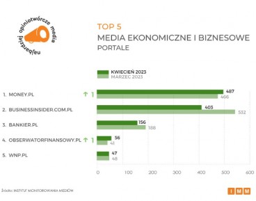
Portal ekonomiczny NBP „Obserwator Finansowy” ponownie znalazł się w czołówce najbardziej opiniotwórczych mediów w kategorii „Media ekonomiczne i biznesowe”, wyprzedzając m.in. „Parkiet”. Wzrost cytowalności treści publikowanych na łamach serwisu wzrósł w kwietniu w odniesieniu do marca 2023 r. o 37 proc.
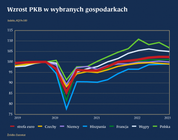
Sytuacja gospodarcza w Polsce na tle innych krajów przedstawia się korzystnie. Warto zauważyć, że w szybkim tempie nadrabiamy dystans dzielący Polskę od poziomu życia w wybranych państwach europejskich. W ciągu ostatnich czterech lat dynamika wzrostu PKB plasowała Polskę powyżej innych krajów europejskich, zarówno strefy euro, w tym Niemiec i Francji, jak i krajów Unii Europejskiej z własną walutą, np. Czech.
Większość polskich przedsiębiorców odczuła skutki wojny w Ukrainie, choć jej wpływ oceniają w zróżnicowany sposób – wynika z badania przeprowadzonego przez Polski Instytut Ekonomiczny.
W styczniu 2020 roku Wielka Brytania formalnie opuściła Unię Europejską. Oczekiwane korzyści z brexitu, poza odzyskaniem suwerenności w zakresie kształtowania prawa i zewnętrznych relacji gospodarczych, jednak się nie zmaterializowały. Widoczny jest natomiast spadek wydajności i konkurencyjności brytyjskiej gospodarki, co wpływa także na kondycję rynku pracy.